Latest Forum Posts
-
Upper Control Arms for Fox 2.0 Coilovers
March 27, 2025 at 09:37:21
-
Fuel Gauge pegged at full
March 27, 2025 at 09:14:35
-
Best front wheel hubs
March 27, 2025 at 08:45:51
-
Crickets
March 27, 2025 at 08:21:20
-
Semi dual exhaust
March 27, 2025 at 08:18:04
- More Posts
Latest Videos
We Love Chevrolet’s Annual Tradition: Heartfelt Video Holiday Cards
For the past few years, Chevrolet has embraced the holiday season with an annual tradition: the release of emotionally resonant video holiday cards. These short films celebrate family bonds, treasured memories, and the enduring relationship between people and their Chevrolet vehicles. By combining touching storytelling with iconic Chevy models, these videos have become a cherished… Continue reading We Love Chevrolet’s Annual Tradition: Heartfelt Video Holiday Cards
Up Next
Ownership

Squeaky or Clunking Rear Leaf Spring on 2020-2025 Silverado & Sierra Duramax? Here’s Why.
If you own a 2020-2025 Chevrolet Silverado 1500 or GMC Sierra 1500 with a 3.0L Duramax LM2 or LZ0, you might have noticed an annoying squeak or clunk coming from the left rear leaf spring. Turns out, there’s a reason for it-and GM has a solution. This issue is caused by diesel fuel contamination. When… Continue reading Squeaky or Clunking Rear Leaf Spring on 2020-2025 Silverado & Sierra Duramax? Here’s Why.
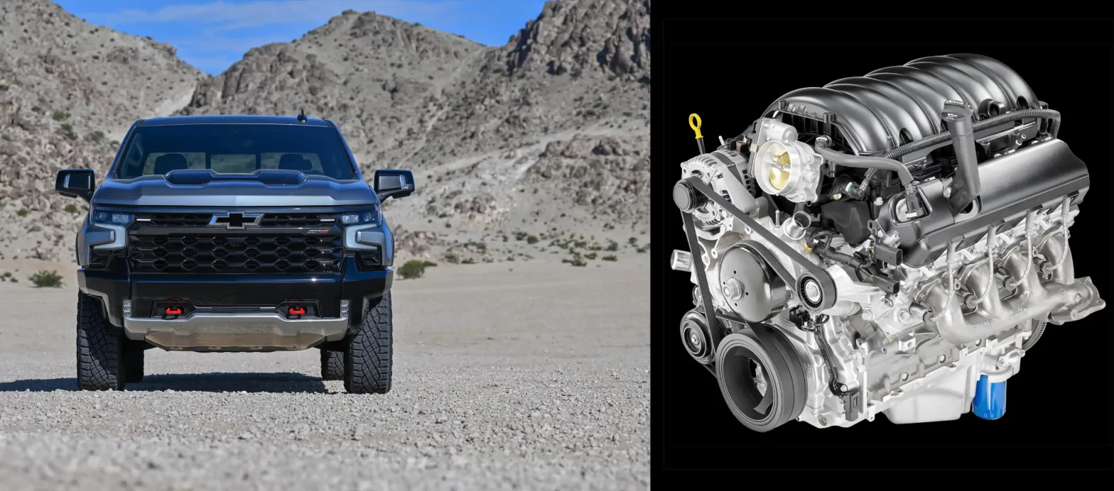
Chirp & Squeak? Why Your GM 6.2L & 6.6L V8 Sounds Different—And Why It’s Normal
If you own a Chevy Silverado, GMC Sierra, Tahoe, Yukon, or even a Cadillac Escalade with the 6.2L L87 or 6.6L L8T V8, you might have noticed some unexpected noises from under the hood. Maybe a chirp, squeak, or sputter caught your ear while idling or restarting. It’s easy to assume something’s wrong, but GM… Continue reading Chirp & Squeak? Why Your GM 6.2L & 6.6L V8 Sounds Different—And Why It’s Normal
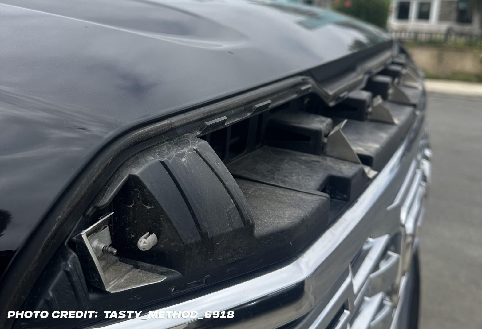
GMC Recalls Over 70,000 Sierra Pickups – Owners Report Grilles Disappearing at Highway Speeds
If you own a 2022 GMC Sierra with a chrome grille, it’s time to take a closer look. General Motors has issued a recall affecting over 70,000 units due to reports of the upper grille trim piece detaching while driving. At GM-Trucks.com, we’re taking a deep dive into this recall—not just repeating the headlines but… Continue reading GMC Recalls Over 70,000 Sierra Pickups – Owners Report Grilles Disappearing at Highway Speeds

Dashcam Shows Terrifying Moment When A GMC Sierra HD’s Rear Wheels Lock-Up While Hauling a Fifth Wheel
Months after General Motors announced a major recall affecting nearly 462,000 diesel-powered trucks and SUVs, new footage has emerged that puts this issue into stark focus. A recent video posted by an owner of a 2020 GMC Sierra 2500HD Diesel demonstrates exactly what happens when the 10-speed automatic transmission fails due to the defect tied… Continue reading Dashcam Shows Terrifying Moment When A GMC Sierra HD’s Rear Wheels Lock-Up While Hauling a Fifth Wheel
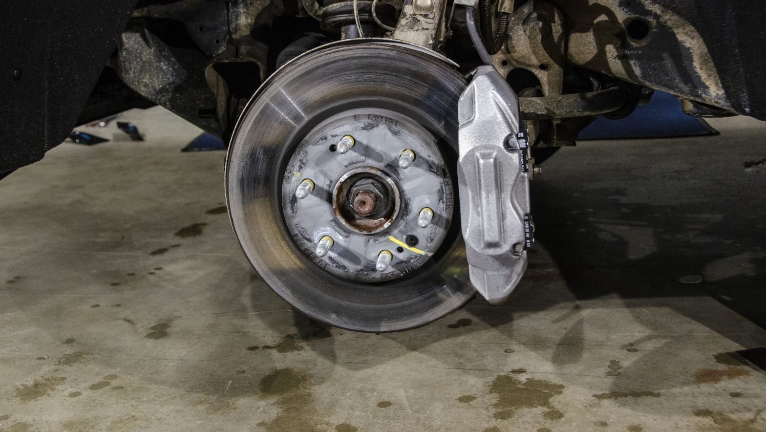
Chevy and GMC Admit Brake Pads on Silverado and Sierra May Only Last a Few Thousand Miles
If you’ve been surprised by how quickly your GM truck or SUV is chewing through front brake pads, you’re not imagining things. GM recently issued a technical bulletin acknowledging premature brake pad wear on many popular models, and it could explain why you’re replacing pads more often than expected. We’ve experienced this ourselves. After owning… Continue reading Chevy and GMC Admit Brake Pads on Silverado and Sierra May Only Last a Few Thousand Miles


